A kitchen that adds value to your home needs space, storage and easy access. A U-shaped kitchen offers all that – plus flexibility.
U-shaped kitchens have three walls that are lined with cabinets and appliances. The layout works well in spaces of all sizes – provided you get the design right. Read on to find out how best to achieve the right U-shaped layout for your home.
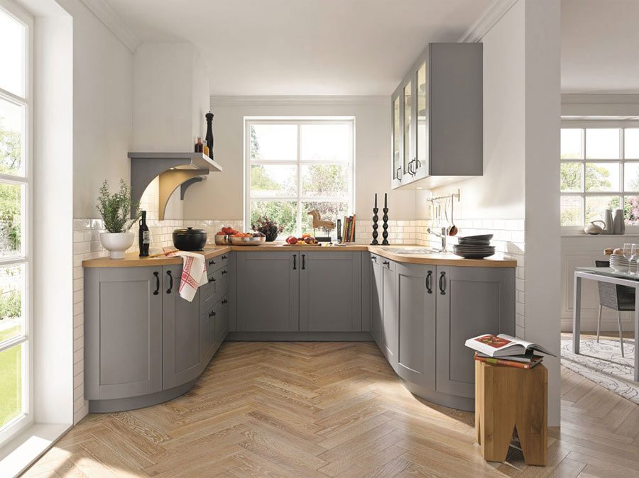
The Casa range, part of the schüller.C collection from InHouse, is shown here in Sand Grey and starts from around £6,426. A 600mm base is around £112.
U-shaped kitchens: the pros
U-shaped kitchens make excellent use of space, which means plenty of storage, room for appliances – either freestanding or built-in – and long worktops.
They’re also easy to use: “The key functions in the kitchen are all strategically placed to create an efficient working pattern,” says Graeme Smith, senior designer at BioGraphy Kitchens.
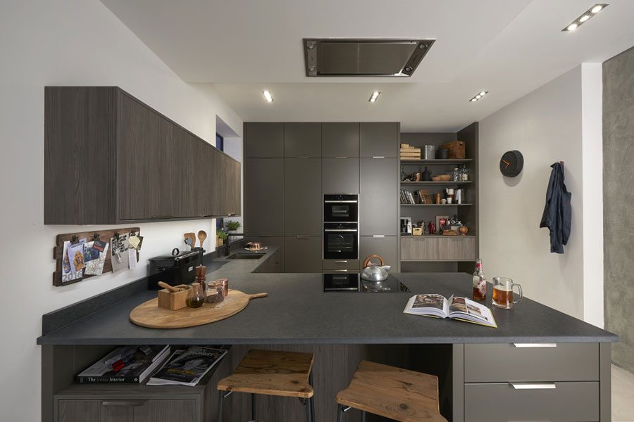
Featuring a mix of Inzo Matt Lava and Character Graphite cabinetry with a Black Linen granite worksurface, this industrial-inspired kitchen by BioGraphy Kitchens is priced from £10,000.
…And the cons
A U-shaped kitchen may work out more expensive than a galley or L-shaped layout. This is simply because there is an extra wall of cabinets and worktops.
Cupboards will occupy most of the walls in a U-shaped kitchen, so you may find they overwhelm the space. “Opt for a neutral colour palette as opposed to bold colours: this will help open up the look of room,” says Hannah Chapple, category manager at Benchmarx Kitchens & Joinery. “You are then free to stamp your own style through your wall and floor choice and accessories.”
Cabinets on every wall can make the room feel too enclosed. “Opt for one wall to have open shelving or shallower cabinets above the base units,” suggests Graeme. You can also create a feeling of more space with a handleless design: your kitchen will instantly look sleeker and less cluttered.
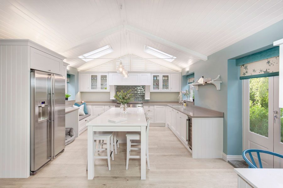
Interior designer Emma Hooton was asked to design a U-shaped kitchen with a central dining area for this busy family home. A similar kitchen by Emma Hooton starts at around £40,000.
Consider the corners
A U-shaped layout will typically feature two corner cabinets, which are known for being awkward because they take up a lot of space but aren’t easy to access. “Internal storage is key to maximising this sort of space,” advises Hannah. “Integrated carousels and pullouts are excellent for convenience as they allow you to locate utensils quickly without having to scramble around at the back of the cupboard for a lost pot or pan.”
Look out for a LeMans storage solution – so-called because it takes its inspiration from the curves of a racetrack. Perfect for corner units, it’s designed to swing out from inside the cabinet, so you can easily check the cupboard contents and reach what you need.
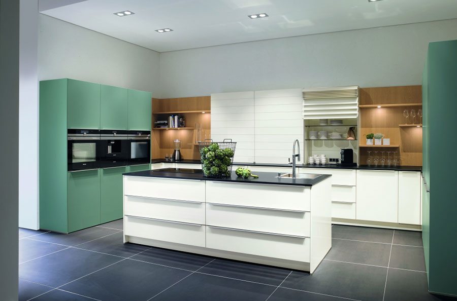
The Proline kitchen by German manufacturer Pronorm channels a contemporary Scandi style in Fjord Blue, Gloss White and natural oak. Prices start from around £15,000.
Slot in an island
If you have space to spare, think about creating extra storage with an island. Measure up carefully if you like this idea: “Ensure there is sufficient room to create plenty of space and flow around the island,” says Graeme. Take into account the depth of the wall units as well the footprint of the island. Allow for around a minimum of 90cm to 1m walking space all the way around the island and a maximum of 1.2m.
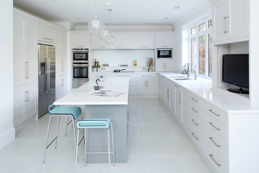
This bespoke kitchen by Rencraft features plenty of storage space thanks to an island and two double-door larders situated either side of the American fridge-freezer. From £18,000.
Plan for a peninsula
A peninsula is often used to create a U-shaped kitchen in an open-plan space, acting as a divider separating the kitchen from the dining and living areas (as seen in the design below) and offering extra storage space.
You could also site a hob or sink on top so that the chef can face into the room while preparing dinner. Plus, by incorporating breakfast bar into your peninsula, you can eliminate the need for a dining table: just extend the worktop beyond the footprint of the island to form a small ledge. Factor in at least 30cm for knee space.
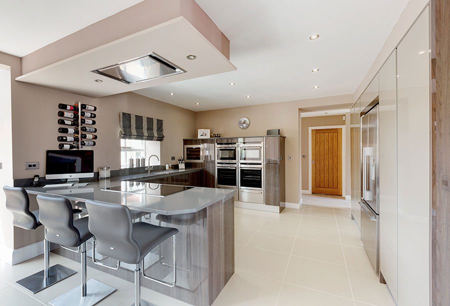
The Furore Gloss kitchen collection by Crown Imperial is available in nine neutral gloss colours including two metallic finishes and four wood styles. Priced from £10,000.
Make room for a dining table
Given that the kitchen is the heart of the home, it’s great to be able to fit in a dining table where friends and family can gather. What size and style of dining table you choose will very much depend on your available space and surrounding décor. Wood works well in this Design Republic kitchen.
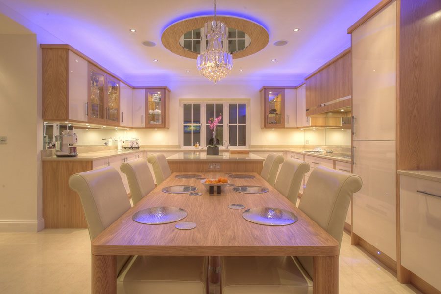
The layout of this bespoke kitchen by Design Republic provides ample storage space and ensures the kitchen is sociable and comfortable. Priced from around £30,000.
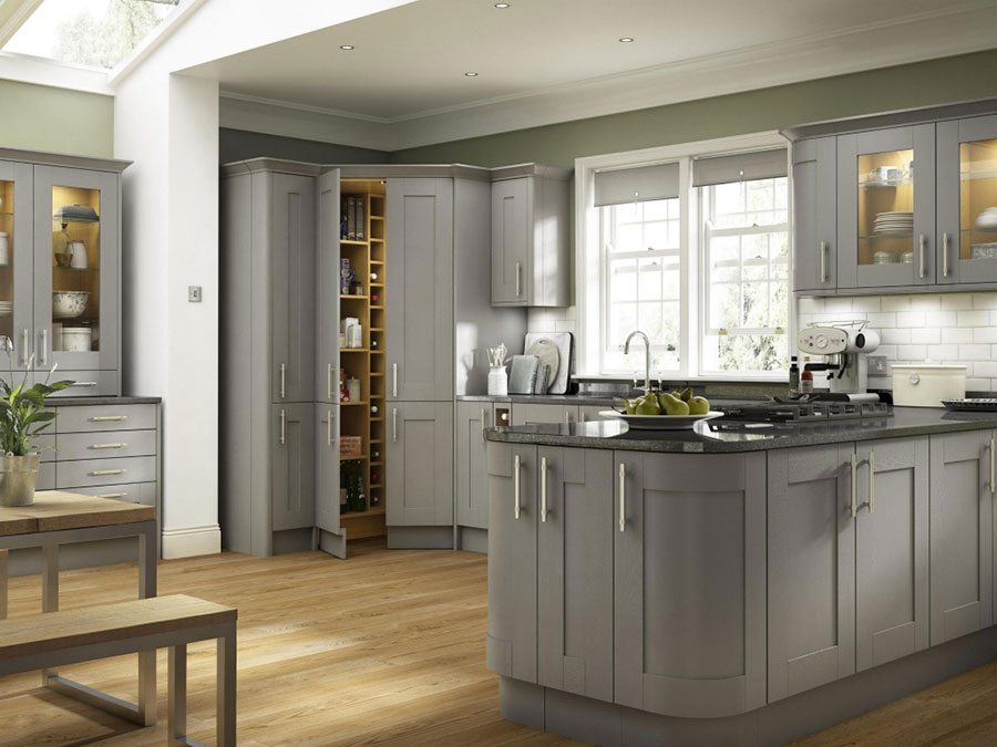
This Somerset Grey kitchen by Benchmarx Kitchens and Joinery is priced from £100 for a 100cm unit.
Learn more about single-wall kitchens and L-shaped kitchens