A sociable couple in south west London commission Roundhouse to create the perfect kitchen for cooks.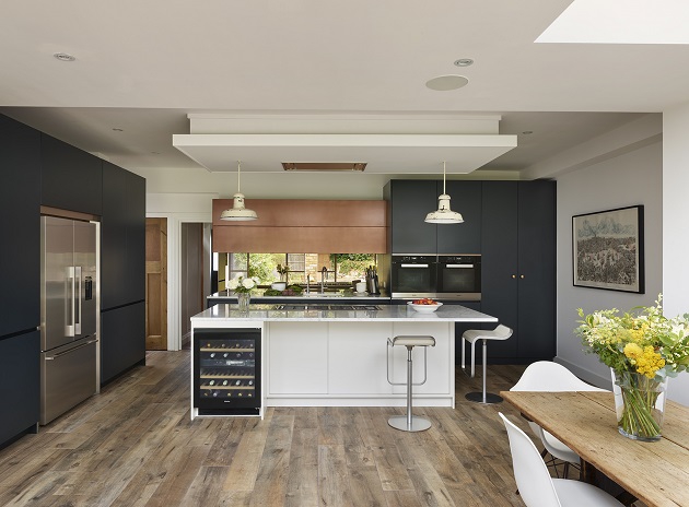
Any designer worth their salt knows that form and function are the essential ingredients of a successful kitchen. But when the client is in the restaurant business and his partner is in fashion, the heat is on to cook up something truly special.
“They didn’t want the kitchen to feel excessively colour-coordinated,” recalls designer Robyn Gifford of Roundhouse. Cue a carefully conceived mix of colours, materials and finishes. “They also entertain regularly, so they wanted a very sociable space,” she adds.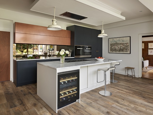 Given the brief, it is no surprise that the island unit – which has pride of place in the centre of the kitchen – is home to the hob. “The client wanted to be able to cook and chat to guests at the same time,” explains Robyn.
Smartly painted in Farrow & Ball Strong White, Carrara marble was selected for the worktop, despite its reputation for staining. “In fact, that was part of the reason why we chose it,” Robyn recalls. “This is a living kitchen, so the client didn’t want to be precious about it being used and becoming less than perfect.”
A wine fridge and generous breakfast bar are incorporated into the island. And to accommodate the couple’s wish for a sociable set-up, Robyn made sure that there was enough space for stools on two sides of the island rather than in a straight line.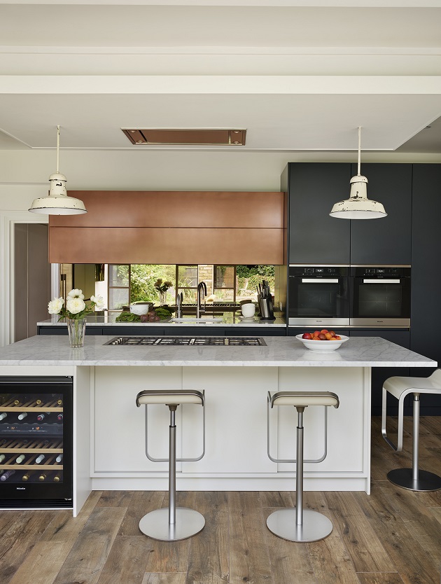
 Low-slung pendants have become the de rigueur way to mark out an island and this kitchen is no exception. A pair of battered metal shades flank a Westin extractor, which was built into a bulkhead because there wasn’t enough space to recess it into the ceiling.
Cleverly, Robyn has made a feature of the bulkhead by making it the same size as the island, so they mirror each other. Even better, the bulkhead is slightly stepped, so it looks as if it’s floating.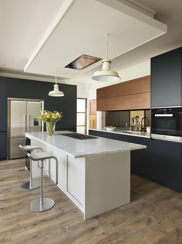 In addition to the island, at the top of the couple’s wish list was a larder cupboard with dedicated racking for wine and shelving for glassware. “This was designed exactly to their specifications, with a walnut interior and marble worktop where they can serve drinks,” says Robyn.
The larder sits to the left of a large, American-style fridge-freezer, which was another must-have. To the right is a breakfast cupboard that boasts plenty of storage and a dedicated space to prepare tea and toast.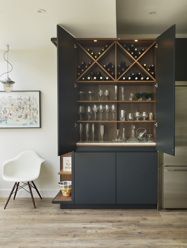
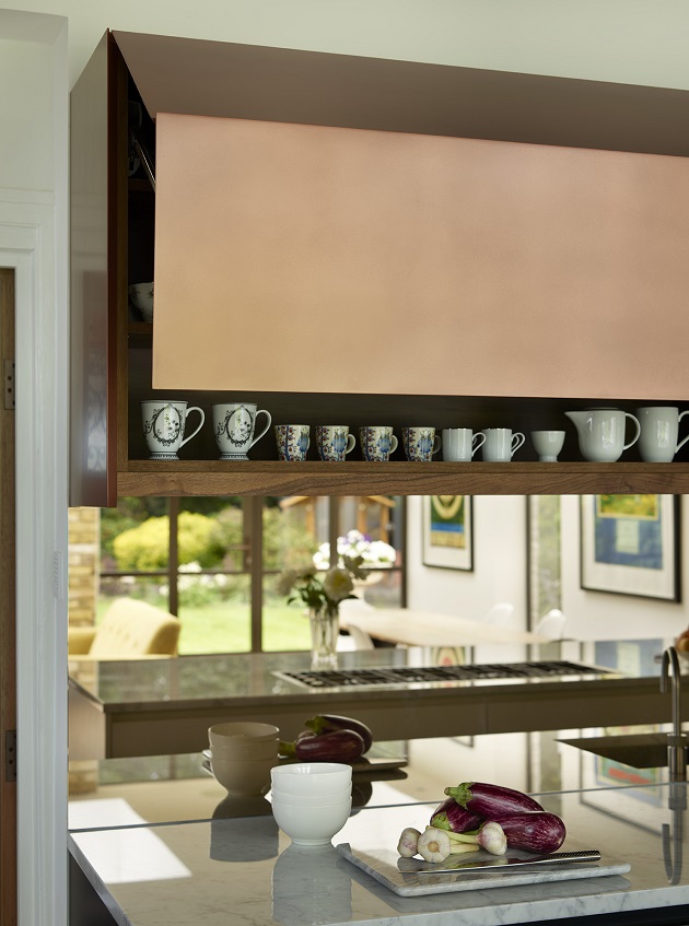
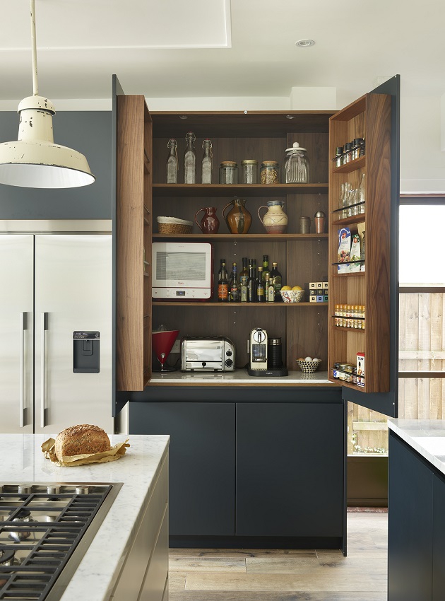 Adjacent to the breakfast cupboard is the pièce de résistance of the kitchen: a pull-up cupboard in a covetable copper finish, which perfectly complements the inky backdrop provided by cupboards painted in Farrow & Ball Blue Black. To add weight to the eclectic vibe, a bronzed mirrored splash back has been thrown into the mix.
“This not only looks fabulous but when you’re at the sink it’s nice to be able to see what’s going on behind you,” says Robyn.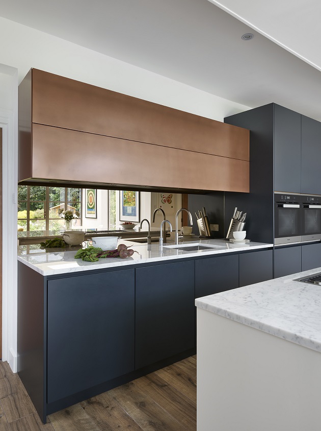
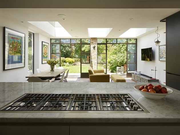
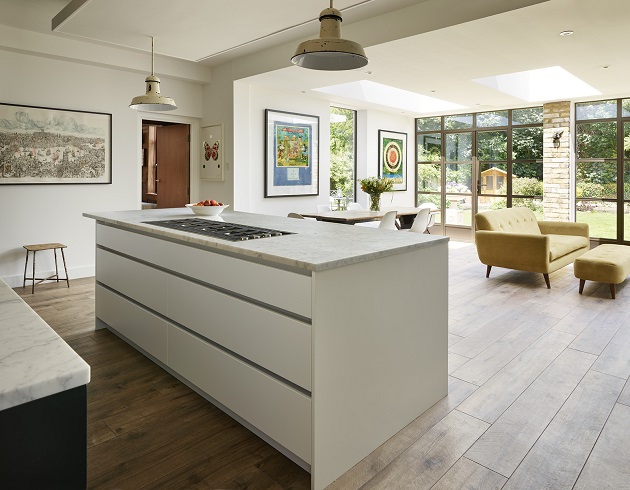
 The new Roundhouse kitchen sits where the old kitchen used to be, which has been extended outwards to include a comfortable living and dining area. Worn-looking, wood-effect tiles that run throughout the space create a unified feel, coming to an end at a pair of Crittall doors that extend the width of the space and open up to the garden. Boosting light levels are three skylights that span the living and dining area to offer a year-round view of the sky.
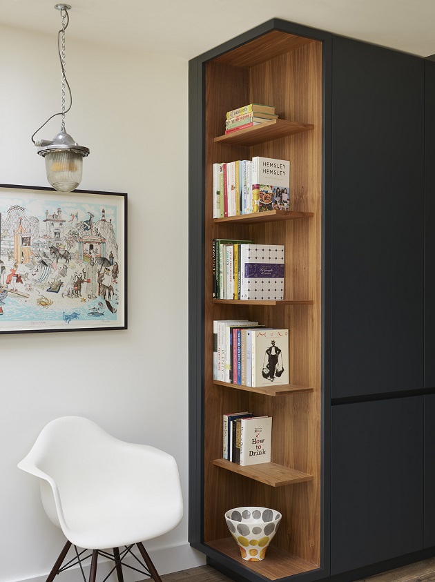
 There are plenty of clever elements throughout the kitchen, including a shelving unit that’s built into the end of the larder unit. This not only keeps the clients’ cookbooks close to hand, it smooths the transition between the kitchen and the living area.
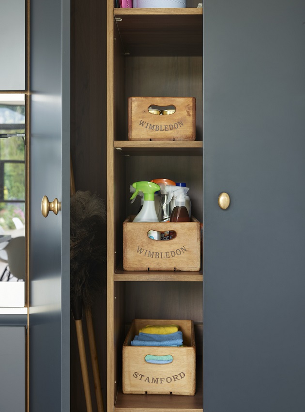
 Another nice touch is the narrow broom cupboard to the left of the pair of ovens on the back wall. Granted, it isn’t the first feature to grab the eye, but cleaning products are a necessity in the kitchen and Roundhouse has stashed them stylishly out of sight.
 Robyn says the clients were thrilled with the finished kitchen. “They were absolutely lovely to work with and the rest of the house is just as beautiful; very welcoming and inviting.”
PROJECT PARTICULARS:
Design
Kitchen designer: Robyn Gifford of Roundhouse
Kitchen
Cabinetry: Urbo matt lacquer bespoke kitchen in Farrow & Ball Blue Black and Strong White with burnished copper matt metallic on the wall cabinet
Worktops: Carrara marble, Roundhouse
Splashback: Bronze mirrored glass, Roundhouse
Appliances: Hob, Barazza; fridge-freezer, Fisher & Paykel; ovens and wine fridge, Miele; extractor, Westin
Sink and taps: Sink, Franke; single lever Oxygen tap, Gessi (right); hot water tap, Quooker.
Flooring: Wood-effect tiles, try European Heritage
Bar stools: For similar, try Lapalma Lem bar stool, from Nest
Pendants: (above island) For similar, try David Hunt Lighting
Dining chairs: Eames DAW armchair and Eames DSW chair for Vitra, try Heal’s
Patio doors: For similar, try Crittall